Documentation
Components
Components are reusable patterns which allow you to create compelling content in a fairly simple way. This page shows example of most components. This component is called "Hero with Background image"
Accordions
This component allows you to create content that is contained inside a set of accordions. The accordions are closed by default and then open when the visitor would like to see the content. The component type is called Accordion Set. You can add accordion items inside the set once it has been created.
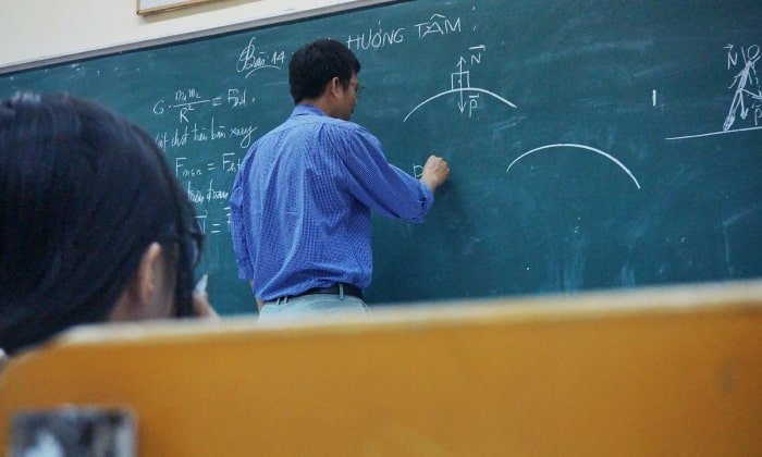
Alternative Text for Images
When adding images to our pages, there’s more to think about than choosing a nice image, cropping it to the correct size, and inserting it in the right spot on the page. We usually think about images solely visually. But what about users who can’t see images?
A very important aspect of images is alternative text, or alt text, as it’s more commonly known.
There is some content hiding below
Unidentified vessel travelling at sub warp speed, bearing 235.7. Fluctuations in energy readings from it, Captain. All transporters off. A strange set-up, but I'd say the graviton generator is depolarized.
The dark colourings of the scrapes are the leavings of natural rubber, a type of non-conductive sole used by researchers experimenting with electricity. The molecules must have been partly de-phased by the anyon beam.
Getting Help
Need some Help?!
What is the best way to get the help you need?
Sometimes you just get stuck. You’re just not sure where to go next, or how to do that one thing that you did six months ago in training. So, what is the best way to get the help you need?
Sometimes you just get stuck. You’re just not sure where to go next, or how to do that one thing that you did six months ago in training. So, what is the best way to get the help you need?
Alert Box
The Alert Box component allows you to add content to a highlighted box with an optional icon. Alert Boxes should be used to contain short content and may include items such as links. There are a number of colour options for both the border and the background to help you communicate meaning with your alert box.
Unidentified vessel travelling at sub warp speed, bearing 235.7. Fluctuations in energy readings from it, Captain. All transporters off. A strange set-up, but I'd say the graviton generator is depolarized.
Unidentified vessel travelling at sub warp speed, bearing 235.7. Fluctuations in energy readings from it, Captain. All transporters off. A strange set-up, but I'd say the graviton generator is depolarized.
Unidentified vessel travelling at sub warp speed, bearing 235.7. Fluctuations in energy readings from it, Captain. All transporters off. A strange set-up, but I'd say the graviton generator is depolarized.
Unidentified vessel travelling at sub warp speed, bearing 235.7. Fluctuations in energy readings from it, Captain. All transporters off. A strange set-up, but I'd say the graviton generator is depolarized.
Audio File
Upload an audio file for people to listen to online or download to listen offline. This is a basic audio feature and does not produce a podcast feed.
Backlinks
The Backlinks component is a simple component intended to act like a breadcrumb trail of links. These links are added manually and help your visitors get an idea of where they are on the website or inside of your section of the website. The links should follow the path all the way back to the main Tyndale landing page which is added automatically for you.
Cards
Cards Set will allow you to add a set of Card components. Here are some example card sets:

Sometimes you may need to put a longer title here.
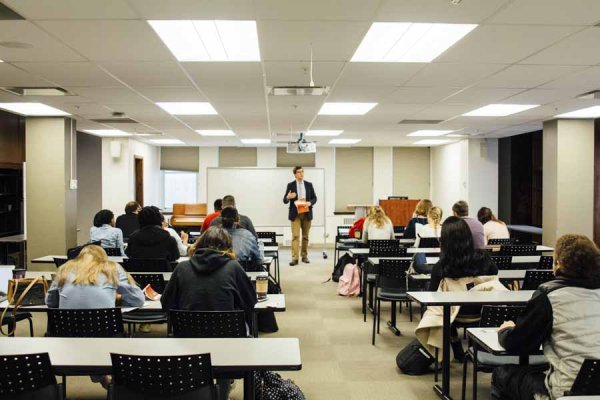
Philosophy professors answer tough questions from the audience at the Worldview conference in 2017
Explore Programs

Any Questions?
Philosophy professors answer tough questions from the audience at the Worldview conference in 2017
Explore Programs
Compelling Title
Do your best to present yourself to God as one approved, a worker who has no need to be ashamed, rightly handling the word of truth. — 2 Timothy 2:15 (ESV)
Read this Chapter
Feature Boxes
Feature Box Set will allow you to add a set of Feature Boxes components in either rows of one, two, three, and four columns. Here is an example:
Box One
Philosophy professors answer tough questions from the audience at the Worldview conference in 2017
Box Two
Philosophy professors answer tough questions from the audience at the Worldview conference in 2017
Box Three
Philosophy professors answer tough questions from the audience at the Worldview conference in 2017
Feature Card with Image
Feature Cards are single cards that will be display content beside an image. You can decide which side the image will be. On smaller screen sizes the image will be place on the top of the card.
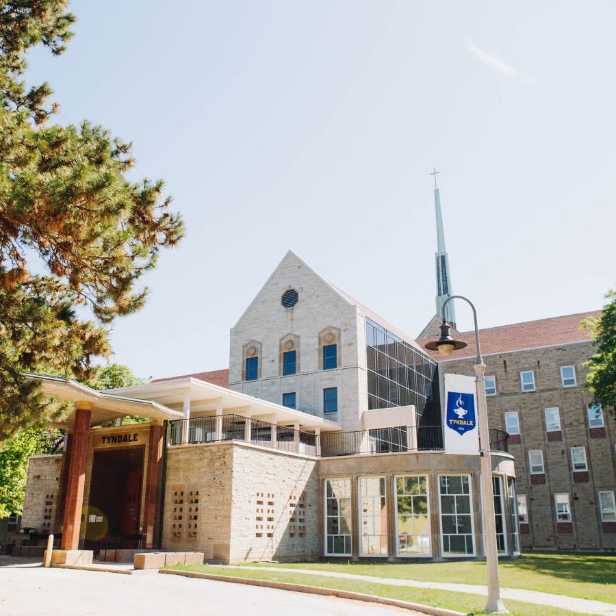
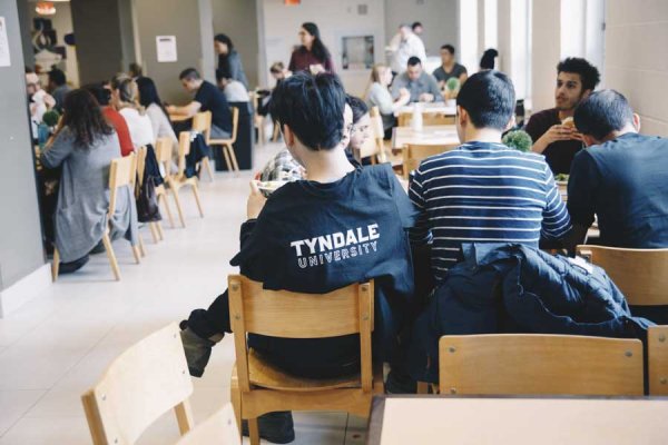
Tyndale University
A Christian University in Toronto Offering a Wide Range of Programs
A Christian university in Toronto offering a wide range of programs at the undergraduate, seminary & graduate levels. Built on over 125 years of history, Tyndale alumni are working in private, public and not-for-profit industries.
Optional LinkFlexible Box Set / Flexible box
This component is made up of multiple parts though you will only be able to see the "Flexible Box Set" option in the list of components. Once you select the Flexible Box Set you will be able to configure the settings for the set of boxes and then add as many boxes as you need. This is a powerful but fairly complex component and we will be happy to demonstrate it for you. You can see an example of this component on the Student Services page laying out the icons.
The Flexible Box component will place your content in equal sized boxes side by side and will continue to add boxes on a single row as long as it has room and then move the next box to a new row. You may choose the size of your box ranging from XXS (60px) to 3XL (400px) and whether there is a gap between each box.
Each box may contain a select number of block based components such as WYSIWYG editor, Links List or Quote. You may also choose to have a border and/or padding on each box individually.
Default Box
This is a flexible box set using the 2XL boxes — about 350px wide. This box is using the default flexible box settings — with medium padding and a single pixel border.

This is a flexible box set using the 2XL boxes — about 350px. This box is using custom flexible box settings — with no padding and no border.
An image was added to this box through the WYSIWYG editor. Images will not exceed the width of the box.
This is a flexible box is using two block-level components — WYSIWYG text and then a Links List.
This is a simple quote added inside of a flexible box with small padding and no border
— Andy Smith
This is a flexible box set using the 2XL boxes — about 350px.. This box is using custom flexible box settings — with medium padding and a thick 5 pixel border.
Same Height
Flexible boxes will be the same height as all other boxes in the same row. This height is based on the tallest of the boxes.
Hero Blocked
This is another hero style to use at the top of your content. This hero has a background image with content contained inside of a dark box on the left hand side of the page. This is a great hero style to use when you want your background image to shine and you don't need a link in the hero section. Note: while both pre-text and sub-text options are available, this tends to function better when only one option is used in most cases.
This is the Pre-text
Main Title Example
Very short subtext option is also available.
Hero with Illustration Image
This is a simple hero style with text and link on the left side and an image or SVG illustration on the right side. This has been designed to be used on the top of the page as a hero component but can also be used in the middle of a page to highlight something important.
Study Online
Tyndale Seminary's online programs allow you to pursue a theological education even if you don’t have the time or flexibility to come to the campus.
View Online Programs
Horizontal Cards
A set of two cards that are layed out horizontally. There is a smaller image to the left of the image. It is best to have two of these cards.


Image Call to Action
Place content with a title, copy, and a button beside an image. You can choose which side the image will be on. On smaller screensizes the image will always be above the content.
A Christian university in Toronto offering a wide range of programs
Built on over 125 years of history, Tyndale alumni are working in private, public and not-for-profit industries.
Explore ProgramsImage Gallery
The Image Gallery component allows you to place a maximum of 16 images. It is best to use around 6 to 10 images.
Links List
Adds a list of links with titles and optional descrptions. You can also change the order of the links.
Resources
-
Board of Governors
Meet the members of the Tyndale Board of Governors.
-
View Tyndale's History
Tyndale's History is illustrated in this interactive timeline — explore our past!
Person Bio
This Component should be used to create either a single bio for a person or a list of persons in a manual list.
The person's name is required but all other fields are optional. These fields include: photo, title, bio, email, phone number, location and website. These options should work within most use cases.
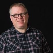
Andy Smith
Manager, Website Strategy & Development
- asmith@tyndale.ca
- 416-226-6620 Ext. 2714
- D405
- http://hammock.tyndale.ws
Andy heads up the website efforts here at Tyndale. He often uses himself or his infomation in examples. His desire is to make sure Tyndale employees have the tools and training to create amazing website content without having to be professional web developers. If you'd like more information about this component, connect with Andy today!
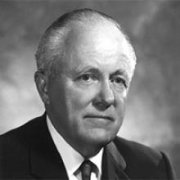
Dr. Stewart Boehmer
President 1975 - 1989 (TBS, OBC)
Dr. Stewart Boehmer was President Toronto Bible College/Ontario Bible College (Tyndale) from 1963 to 1973. He was born in 1907 in Kitchener, Ontario, and attended Benton Street Baptist Church with his family while growing up. He graduated from Moody Bible Institute in 1933, and his first pastorate was at First Baptist Church in Waterloo, Ontario. In 1943, he accepted an invitation to be the pastor of St. John’s Evangelical Church (later Calvary Church) in Toronto, Ontario, leading the church through a major building project and growing their missions and Sunday School ministries...
Quotes
You can create mulitple types of quotes that stand out using this flexible component. There are many different variations you can create — demos below. These will work best to highlight a part of the copy you have elsewhere in the document or as quick-tip type content.
Lorem ipsum dolor sit amet, consectetur adipiscing elit. Sed nunc lectus, consectetur quis placerat a, ultricies vel dolor. Fusce id sagittis lectus, lacinia malesuada tellus. Duis rutrum neque ut mattis tempor.
— Lorem ipsum dolor
Wireless printing from personal devices is available available at https://print.tyndale.ca, or you can use a computer in one of the Tyndale Computer Labs.
Big Quotes are a very flexible component — try out some of the different display options to see what you can achieve.
Videos
Videos can be embeded from either Vimeo or Youtube and displayed on your page. These videos, like any component, can be added and moved in any order of the page.
Sections
Below are the different column sections that can be created on a page. Examples of each section are listed below.
Each section has columns, and each column has a content box for the content. You can add a border and choose a background color for the content box.
Two Column Section
Content Box 1
Content Box 2
Three Column Section
Content Box 1
Content Box 2
Content Box 3
Four Column Section
Content Box 1
Content Box 2
Content Box 3
Content Box 4
4/8 Section
Content Box 1
Content Box 2
8/4 Section
Content Box 1
Content Box 2
6/3/3 Section
Content Box 1
Content Box 2
Content Box 3